Liif Mag Demo 1
Published 2014-03-23 23:12:00
@ magazine.wil.dk
Torben Wilhelmsen

Grid

Cover

Do not underestimate the exertion in going down

Now and then the Internet happens to be so irritating

Laying out numbers

Sustainable editable


Understanding the exertion
Don’t make me feel stupid
Do not underestimate
the exertion
in going down
I also live with the Internet seductively easy helps me remember stuff that I – all things considered – would be better of by putting a little effort in trying to remember without life lines. But that’s a completely different discussion.
Irritating is also code language or otherwise incomprehensible speak or competences that a web site wrongly assumes I have. Simply bad communication, and that also apply AFK.
Ads, for instance, are irritating and likewise is the misconception that something is free because it is financed through advertisements. As well as personalized emails with freestyle talk like “Do you love learning ...” from a course site on Valentine’s Day. Irritating is the endless insisting on that I should get this or that because someone I know did the same. I don’t mind being told (from people I know or have trust in) about why they bought it, but the narrow algorithmic approach to my needs is close to be insulting.
And, yes, Flash sites on the smartphone are irritatng, off course. But all this I normally manage to ignore.
I also live with the Internet seductively easy helps me remember stuff that I – all things considered – would be better of by putting a little effort in trying to remember without life lines. But that’s a completely different discussion.
Irritating is also code language or otherwise incomprehensible speak or competences that a web site wrongly assumes I have. Simply bad communication, and that also apply AFK.
Steve Krug hit the usability bull’s eye in 2000 with the book “Don’t Make Me Think” and created with that title a tenable tagline for usability on the web. Which still makes sence, since every time I stop and think “Ehrm, what does that mean” there’s a risk that I don’t complete what I came for.
That said, I actually don’t mind that web sites make me think, not only about the content, but also about the world or just how the current web site is put together. I like to challenge the conventional thinking – not all should be be constructed the same way or by using the same method.
I can live with a web site with a ‘challenging’ sense of usability. But there has to be some kind of meening, a logic, that is within reach through a little thinking or trying. Maybe something smart could be revealed. Otherwise could I easily end up feeling stupid, And that is the really annoying.

Now and then the Internet happens to be so irritating
Now and then the Internet can be so irritating. It looks so appealingly easy, with recognisable structures, and yet chaos is reigns.

Ads, for instance, are irritating and likewise is the misconception that something is free because it is financed through advertisements. As well as personalized emails with freestyle talk like “Do you love learning ...” from a course site on Valentine’s Day. Irritating is the endless insisting on that I should get this or that because someone I know did the same. I don’t mind being told (from people I know or have trust in) about why they bought it, but the narrow algorithmic approach to my needs is close to be insulting.
And, yes, Flash sites on the smartphone are irritatng, off course. But all this I normally manage to ignore.
I also live with the Internet seductively easy helps me remember stuff that I – all things considered – would be better of by putting a little effort in trying to remember without life lines. But that’s a completely different discussion.
Irritating is also code language or otherwise incomprehensible speak or competences that a web site wrongly assumes I have. Simply bad communication, and that also apply AFK.

I can live with a web site with a ‘challenging’ sense of usability. But there has to be some kind of meening, a logic, that is within reach through a little thinking or trying.

I actually don’t mind that web sites make me think, not only about the content, but also about the world or just how the current web site is put together. I like to challenge the conventional thinking – not all should be be constructed the same way or by using the same method.
Steve Krug hit the usability bull’s eye in 2000 with the book “Don’t Make Me Think” and created with that title a tenable tagline for usability on the web. Which still makes sence, since every time I stop and think “Ehrm, what does that mean” there’s a risk that I don’t complete what I came for.
That said, I actually don’t mind that web sites make me think, not only about the content, but also about the world or just how the current web site is put together. I like to challenge the conventional thinking – not all should be be constructed the same way or by using the same method.
I can live with a web site with a ‘challenging’ sense of usability. But there has to be some kind of meening, a logic, that is within reach through a little thinking or trying. Maybe something smart could be revealed. Otherwise could I easily end up feeling stupid, And that is the really annoying.
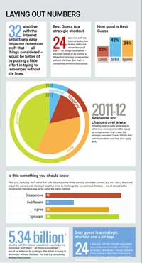
Laying out numbers
32 also live with the Internet seductively easy helps me remember stuff that I – all things considered – would be better of by putting a little effort in trying to remember without life lines.
Best Guess is a strategic shortcut
24 also live with the Internet seductively easy helps me remember stuff that I – all things considered – would be better of by putting a little effort in trying to remember without life lines. But that’s a completely different discussion.
How good is Best Guess

Is this something you should know
That said, I actually don’t mind that web sites make me think, not only about the content, but also about the world or just the current web site is put together. I like to challenge the conventional thinking – not all should be be constructed the same way or by using the same method.
Disapprove
Slightly
Significant
Totally
Indifferent
Slightly
Significant
Totally
Agree
Slightly
Significant
Totally
Ignorant
Slightly
Significant
Totally
5.34 billion
I also live with the Internet seductively easy helps me remember stuff that I – all things considered – would be better of by putting a little effort in trying to remember without life lines. But that’s a completely different discussion.
Best guess is a strategic shortcut and a pit trap
24 I also live with the Internet seductively easy helps me remember stuff that I – all things considered – would be better of by putting a little effort in trying to remember without life lines. But that’s a completely different discussion.

Sustainable editable
The Internet is OK, I think we should keep it, but now and then it happens to be so irritating.
The Internet is OK, I think we should keep it, but now and then it happens to be so irritating. Ads, for instance, are irritating and likewise is the misconception that something is free because it is financed through advertisements. As well as personalized emails with freestyle talk like “Do you love learning ...” from a course site on Valentine’s Day. Irritating is the endless insisting on that I should get this or that because someone I know did the same. I don’t mind being told (from people I know or have trust in) about why they bought it, but the narrow algorithmic approach to my needs is close to be insulting.
And, yes, Flash sites on the smartphone are irritating, off course. But all this I normally manage to ignore.
I also live with the Internet seductively easy helps me remember stuff that I – all things considered – would be better of by putting a little effort in trying to remember without additional life lines. But that’s a completely different discussion.
Irritating is also code language or otherwise incomprehensible speak or competences that a web site wrongly assumes I have. Simply bad communication, and that also apply AFK.
Steve Krug hit the usability bull’s eye in 2000 with the book “Don’t Make Me Think” and created with that title a tenable tagline for usability on the web. Which still makes sence, since every time I stop and think “Ehrm, what does that mean” there’s a risk that I don’t complete what I came for.
That said, I actually don’t mind that web sites make me think, not only about the content, but also about the world or just how the current web site is put together. I like to challenge the conventional thinking – not all should be be constructed the same way or by using the same method.
I can live with a web site being ‘challenging’ in the usability sense. But there has to be some kind of meening, a logic, that is within reach through a little thinking or trying – something smart may even be revealed. Otherwise I could easily end up feeling stupid, And that is the really annoying.


